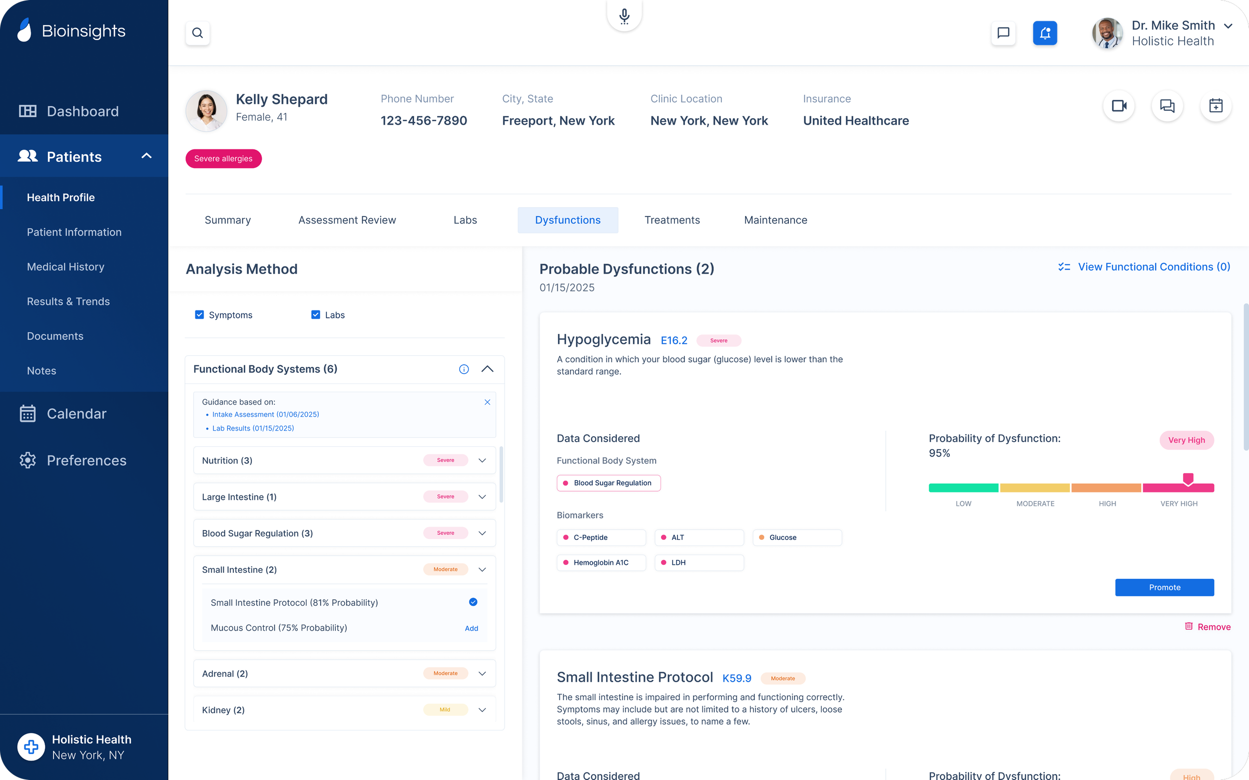
Bioinsights Web Platform
A comprehensive platform that enables access to functional medicine, equipping healthcare providers with the tools and insights needed to deliver personalized, patient-centered care.
Project Overview
Role: Founding Product Designer
Company: Med-Tech Startup (B2B2C)
Timeline: December 2023 - Present (concept —> launch —> post MVP)
Bioinsights empowers healthcare providers to deliver root-cause care through functional medicine, helping patients achieve optimal health. The platform offers an all-in-one solution, equipping providers with the insights, tools, and resources needed to practice functional medicine seamlessly. From patient intake and virtual visits to diagnostics, treatment plans, and fulfillment, Bioinsights streamlines every step of the provider-patient journey in a single platform.

Challenge
Many healthcare providers have faced significant challenges in adopting functional medicine due to limited experience, knowledge gaps, and a lack of standardized protocols. Furthermore, they often have to navigate multiple platforms or systems to meet both their own needs and those of their patients, which complicates the process. As a result, the barrier to entry has been prohibitively high for many practitioners, causing them to turn away from functional medicine due to constraints like education, time, and resources. Due to this, it also remains difficult for patients to find and receive quality root-cause care from providers.
Accessibility is limiting potential.
Solution
With the Bioinsights platform, our goal is to offer an all-in-one solution for accessing, practicing, and receiving personalized care through functional medicine. This platform not only provides healthcare providers with the essential tools and resources to deliver effective functional medicine, but also broadens access to root-cause care, enabling personalized and targeted treatments for a larger patient base at scale.
All-in-one solution for root-cause care.
Collaborating Through Constraints
To launch our MVP product, we needed to move quickly. With limited resources and a lean team, we relied heavily on real user feedback to stay ahead. By maintaining ongoing discussions with leadership and stakeholders in the functional medicine space, we ensured that user needs were central to our design decisions. This approach allowed us to prioritize features that would provide the most value while putting less critical ideas on hold for future refinement. Our in-house functional medicine provider and her team were essential throughout the discovery phase and the entire MVP design process. Their insights helped us identify several key elements that drove the initial platform design:
A clear, linear workflow
The process a provider follows with their patients, much like design, involves several stages before achieving successful outcomes. Providers require a clear, linear workflow for each patient, though certain steps may need to be revisited, making the process cyclical at times. Early steps in the process impact later ones, creating the need to easily access and reference previous information at every stage. To optimize efficiency, providers must minimize time spent navigating the platform and know exactly where to go at each step. A well-structured linear workflow simplifies the complexities of a medical platform, enabling providers to work more efficiently, stay focused on their tasks, and prioritize their patients' needs.
Many medical platforms struggle with overcrowding information on a single screen. While information is essential for driving action, it's crucial to eliminate unnecessary details to prevent users from feeling overwhelmed or frustrated. Our platform is designed with this in mind, ensuring that every piece of information has its designated space. Although we will continue to refine and optimize how information is organized, our priority is to make only the most relevant details easily accessible throughout the provider-patient workflow. By reducing excess data, we aim to streamline the user experience and eliminate the frustration of sifting through irrelevant information.
Removal of excess noise
Emphasis on all-in-one
We’ve worked diligently to ensure that providers can access the information they need at every stage of the process with their patients. Whether deciding which labs to order or reviewing details for a treatment plan, relevant patient information is readily available—via links, dropdown menus, info icons, or directly on the screen. This streamlined access enhances efficiency by reducing the need to navigate between screens, enabling providers to make informed decisions more quickly and effectively.
Modern, clean, familiar visuals
Change is rarely welcomed, and adapting to it takes time—providers are no exception. With their busy schedules and the overwhelming amount of information they need to manage, they need a seamless way to adopt new platforms without spending days or weeks learning the ins and outs of a new system. To address this, we've kept the visual design familiar, mirroring other medical platforms with a minimalist approach, consistent functionality, and a clean, modern update. The result is an intuitive interface that helps providers stay focused on what matters most.
Resources and educational material
We prioritize guidance and education for both patients and providers. Recognizing that no one has all the answers, we've integrated reminders, insights, and guidance throughout every step of the process—from reviewing and ordering labs to selecting treatment protocols and creating personalized care plans. This ensures providers have all the necessary information to make the most informed decisions for their patients' health. For patients, we’ve got them covered too. At key points throughout their health journey, we send clear instructions and educational materials that not only explain the "why" behind their provider’s decisions but also offer detailed explanations of test results, potential conditions, and treatment plans.
Design System
Features
Calendar & Telehealth
The platform's fully integrated calendar feature provides healthcare providers with a seamless way to view, manage, and schedule appointments. This feature also supports telehealth consultations, enabling providers to effortlessly broaden their patient base while giving patients the flexibility to choose how they meet with their provider—whether in person or remotely. With this functionality, geographical limitations are no longer a barrier to accessible care.
AI-Integrated Notes
AI-integrated notes enhance provider efficiency by streamlining the process of documenting patient findings. The platform offers customizable templates to define the type of note, while also allowing providers to seamlessly incorporate a variety of data sources—such as documents, audio or video recordings, and free text input—into the note generation. Notes are automatically generated based on the attached information, ensuring that all relevant findings are included and no critical details are overlooked.
Audio Recording & Transcription
Our audio and transcription feature enables healthcare providers to easily record voice notes directly from a patient's profile at any time. These recordings are automatically saved in the patient's document history as both an audio file and a transcription, ensuring accurate and efficient documentation. Providers can also attach these files to generated notes, streamlining patient care and maintaining comprehensive records.
Patient Education Material
Every stage of the provider-patient journey uncovers valuable insights into the patient's health. From lab results and potential conditions to details about their treatment plan, we compile this information into a clear, comprehensive PDF. This ensures patients are fully informed, empowering them to take an active role in their healthcare and eliminating any uncertainty about their well-being.
The Bioinsights Core Workflow
Our platform guides providers through every step of the patient care process, integrating each phase of the provider-patient journey into a seamless, cohesive experience.
Streamlining the Provider-Patient Journey
01. Patient Assessment
A thorough, in-depth assessment of the patient’s health, identifying symptoms and evaluating body systems to uncover potential underlying conditions.
02. Biomarker Analysis
The platform helps providers identify and order the most relevant lab tests for optimal detection, with flexibility to adjust based on the severity of the patient's symptoms and body system score.
03. Patient Analysis
The system cross-references lab results, reported symptoms, and health history to assess the likelihood of underlying dysfunctions, providing clear insights that inform treatment decisions for the individual patient.
04. Treatment Protocols
With over 200 protocols tailored to specific conditions, we deliver personalized treatment plans designed to address the unique needs of each patient.
05. Fulfillment
Our in-house fulfillment service enhances patient adherence by managing treatment packaging, shipping, subscription, and inventory for providers, ensuring a smooth and efficient process from start to finish.
Results
Bioinsights is an all-in-one platform designed to make functional medicine more accessible for healthcare providers. Through it's streamlined workflow and productivity tools, it boosts provider efficiency and productivity, while guiding providers at every stage to ensure accuracy and up-to-date patient health information. The platform offers valuable insights and educational resources, keeping essential information readily available and empowering providers to select the most effective treatments for their patients. It also enhances patient engagement by providing clearer visibility into their health and treatment plans. By integrating these features into a single platform, Bioinsights helps providers deliver optimal care and achieve the best possible health outcomes for their patients.
Empowering root-cause care


